settings.manifest.json Guide
The settings.manifest.json file defines the structure of your feature's settings interface and database storage. This file is required for proper feature functionality.
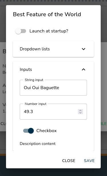
Example of settings interface generated from this manifest
Complete File Structure Example
{
   "parameters": [
      {
         "name": "parameter_name",
         "content": "default_value"
      }
   ],
   "sections": [
      {
         "label": "Section Title",
         "inputs": [
            {
               "label": "Input Label",
               "parameterName": "parameter_name",
               "type": "input_type",
               "settings": "optional_settings"
            }
         ]
      }
   ]
}
Core Concepts
- Parameters
Parameters define the data storage for your feature's settings.
{
   "name": "unique_parameter_identifier",
   "content": "default_value"
}
name: Unique identifier (used to reference in inputs)content: Default value (string only)- All values are stored as strings in the database
- Settings Structure
Settings are organized in sections containing various input types.
{
   "label": "Section Name",
   "inputs": [
      {
         "label": "Input Label",
         "parameterName": "parameter_name",
         "type": "input_type",
         "settings": "type_specific_settings"
      }
   ]
}
Dropdown List

{
   "label": "Options",
   "parameterName": "selected_option",
   "type": "dropdownList",
   "settings": "Option 1,Option 2,Option 3"
}
- Items separated by commas
- Stores selected item as string
Action Dropdown List
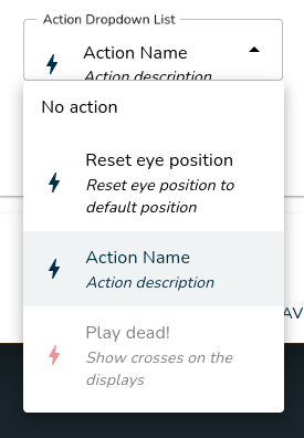
{
   "label": "Available Actions",
   "parameterName": "selected_action",
   "type": "actionDropdownList"
}
- Shows all available actions from installed features/resource packs
- Stores selected action GUID
- Grayed items = actions from inactive resource packs
String Input

{
   "label": "Text Input",
   "parameterName": "text_value",
   "type": "stringInput"
}
- Basic text input field
- Accepts any string value
Number Input

{
   "label": "Numeric Value",
   "parameterName": "number_value",
   "type": "numberInput"
}
- Validates numeric input only
- Stores value as string
Password Input
Requires API Version 1.1 or higher

{
   "label": "Password Label",
   "parameterName": "password_value",
   "type": "passwordInput"
}
Checkbox

{
   "label": "Enable Feature",
   "parameterName": "feature_enabled",
   "type": "checkbox"
}
- Stores
true/falseas string - Visual toggle switch
Divider
Requires API Version 1.1 or higher
{
   "type": "divider"
}
Description

{
   "label": "Information Section",
   "type": "description"
}
- Requires API Version 1.1 or higher: supports basic HTML tags
- Static text display
- No parameter association needed
- Useful for section explanations
Complete Example
{
   "parameters": [
      {
         "name": "user_name",
         "content": "Default User"
      },
      {
         "name": "notification_sound",
         "content": "true"
      },
      {
         "name": "volume_level",
         "content": "50"
      }
   ],
   "sections": [
      {
         "label": "User Settings",
         "inputs": [
            {
               "label": "Your Name",
               "parameterName": "user_name",
               "type": "stringInput"
            }
         ]
      },
      {
         "label": "Notifications",
         "inputs": [
            {
               "label": "Enable Sound",
               "parameterName": "notification_sound",
               "type": "checkbox"
            },
            {
               "label": "Volume Level",
               "parameterName": "volume_level",
               "type": "numberInput"
            }
         ]
      }
   ]
}